
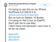
but is now, already, in Debian 10,
and, taking into account that, Debian's "DejaVu Sans Book" substitute for Twitter's "Gotham" is now displayed in a way that resembles more the latter (i.e. the original one) - and, also noticing how the fonts in Firefox and Thunderbird - as I previously said - (and, also in Xfce when I tried it, I got the impression) are now more easily readable...
I suppose that, this has just been an "upgrade", in the fonts' rendering, then - since, the changes that can be observed have generally been for the better.
And, the fact that some of us don't like some of these changes, at first, is probably just the reaction that a person usually has, when is used to something - and, that usually goes away when a person gets used to the new version of a thing.
(In my case, it definitely is... Since that, when I moved from Ubuntu to Debian, I missed the fact that the fonts used in Firefox and Thunderbird were more vertically stretched, and therefore easily readable, in Ubuntu. And, now that I was already used to the previous way that Debian rendered such fonts, I now find it "gross", or less elegant, that Debian is rendering such fonts in the same way as Ubuntu...)