Scheduled Maintenance: We are aware of an issue with Google, AOL, and Yahoo services as email providers which are blocking new registrations. We are trying to fix the issue and we have several internal and external support tickets in process to resolve the issue. Please see: viewtopic.php?t=158230
About the LCD ClearType patch
-
gradinaruvasile

- Posts: 935
- Joined: 2010-01-31 22:03
- Location: Cluj, Romania
- Contact:
Re: About the LCD ClearType patch
Really? Either it works for me or am I completely blind. But I think its the first one.
Would you mind posting a before/after screenshot?
Would you mind posting a before/after screenshot?
-
shifteight
- Posts: 2
- Joined: 2010-05-21 07:11
Re: About the LCD ClearType patch
Really no need to patch cairo? I hope it be good news! I'll try it soon!
-
shifteight
- Posts: 2
- Joined: 2010-05-21 07:11

Re: About the LCD ClearType patch
I did. And fonts were awful, I still need patched cairo.careta wrote:See for yourself! Great fonts!
The thing is, I'm not a specialist. I'm just using patched version of cairo and suggestions from David Turner's website. That's all, but it's working for me (:gradinaruvasile wrote:You should post a thread about this in the how-to section too. I think there are many Debian users who want hassle-free smooth fonts.
And some documentation would be useful there - mostly about setting the system fonts (linking the /etc/fonts/conf.d/ /etc/fonts/conf.avail/ may not be not straightforward for casual users).
Re: About the LCD ClearType patch
Sorry if I misled you.
I have a crappy 1280x800 LCD panel in my laptop and a high quality 1920x1080 external LCD panel. The only difference, in both monitors, with my settings (slight hinting, 96 dpi) using the lcddefault filter is when I set RGB subpixel smoothing on. With greyscale smoothing (the one I like) there is no difference between using the patched libcairo2 or Debian's current testing version.
The thing is that the use of RGB vs greyscale is a purely personal thing. For me using RGB is unthinkable - the fonts become sharper, but they overall readability goes down, as I can "see" the RGB smoothing (all the coloured pixels) around each letter. This is very annoying to me and gives me headaches in the long run!
To the readers of this thread I would suggest to try my settings and then compare with the patched version + RGB + lcddefault. As said above, this is a purely personal thing, and also dependant on your monitor type and eye sensitivity - I'm not saying I have super eyes, in fact I have poor eyesight and that might be the reason I prefer these settings.
Re: About the LCD ClearType patch
You certainly did not -- it's working for you, it doesn't have to work for me as well. I presume that both of us have different machines, LCD screens and so on.careta wrote:Sorry if I misled you.
Well, this isn't weird at all -- patch is only for RGB subpixel, so it won't work on any other options (like greyscale). Also, not every LCD is made for 96 dpi, I, for example, am using 99 dpi (I found somewhere in Internet that 99 is the best dpi option for my monitor and I got used to it).careta wrote:I have a crappy 1280x800 LCD panel in my laptop and a high quality 1920x1080 external LCD panel. The only difference, in both monitors, with my settings (slight hinting, 96 dpi) using the lcddefault filter is when I set RGB subpixel smoothing on. With greyscale smoothing (the one I like) there is no difference between using the patched libcairo2 or Debian's current testing version.
You see, same thing was happening to me when I was changing to RGB subpixel slight hinting, but it was before I was using patch. The patched version is removing those irritating colored pixels around each letter and make fonts look beautiful. At least it's working like that for me, but I guess I wasn't and I am not the only one for whom David Turner's LCD ClearType-like patches are working like they should.careta wrote:The thing is that the use of RGB vs greyscale is a purely personal thing. For me using RGB is unthinkable - the fonts become sharper, but they overall readability goes down, as I can "see" the RGB smoothing (all the coloured pixels) around each letter. This is very annoying to me and gives me headaches in the long run!
Re: About the LCD ClearType patch
You can check out the DPi spec for your monitor here:Hadret wrote:
Well, this isn't weird at all -- patch is only for RGB subpixel, so it won't work on any other options (like greyscale). Also, not every LCD is made for 96 dpi, I, for example, am using 99 dpi (I found somewhere in Internet that 99 is the best dpi option for my monitor and I got used to it).
http://www.prismo.ch/comparisons/desktop.php
http://www.prismo.ch/comparisons/notebook.php
For my case, one of my monitors is 96 and the other 107. So I go for the least. Also if you use Google Chrome the page rendering is fixed by default at 96 DPI at can't be changed (webkit limitation).
Re: About the LCD ClearType patch
According to this, for my 22" (1680x1050) monitor I should use 90.1 DPI?careta wrote:You can check out the DPi spec for your monitor here:
http://www.prismo.ch/comparisons/desktop.php
http://www.prismo.ch/comparisons/notebook.php
Didn't knew about it, thanks for the info (:careta wrote:For my case, one of my monitors is 96 and the other 107. So I go for the least. Also if you use Google Chrome the page rendering is fixed by default at 96 DPI at can't be changed (webkit limitation).
-
gradinaruvasile
- Posts: 935
- Joined: 2010-01-31 22:03
- Location: Cluj, Romania
- Contact:
Re: About the LCD ClearType patch
The 1680x1050 has the default set to 88. But with 90 the fonts look a bit wider (i use Liberation sans for system fonts). Anyway it still looks good.
Re: About the LCD ClearType patch
So, anyone know how to get the same result with Evince.
http://lists.cairographics.org/archives ... 18859.html
http://lists.cairographics.org/archives ... 18859.html
Re: About the LCD ClearType patch
Does anyone know if the Ubuntu patches have made it upstream? I'd ideally like the nice fonts, stuff in Iceweasel looks terrible most of the time!
Perhaps if anyone has 64bit Debs ready made..?
Perhaps if anyone has 64bit Debs ready made..?
Debian Testing AMD64
Re: About the LCD ClearType patch
OK, so I now have patched packages installed and see no difference. Am I the only person that has the patched stuff and is still having issues?
Debian Testing AMD64

Re: About the LCD ClearType patch
Font rendering has always been an issue of interest for me. What's genuinely bothered me is the rendering of fonts in Firefox and in Emacs. I have preferred the Ubuntu approach, though not in all situations. I had read lots about this patch, but never applied it. Today I tried it out and can show some results. It's still not perfect, but I do like some of the changes, and think it's worth further tweaking. What I can add are before/after screenshots on Squeeze, with an added variable: the setting of rgba in ~/.fonts.conf (see man fonts.conf or the dozens of articles and guides online).
For the font-rendering settings in Gnome I used “Subpixel (LCDs)” under smoothing, “Full” under hinging, and “RGB” under subpixel order. The resolution is set to 94 dpi based on the value I calculated. Here is the .fonts.conf I used; the only line I edited for these screenshots is the value for rgba (see the comment here, which is cited in this Lenny review):
I used pinning to switch between squeeze's current libcairo2, currently at version 1.8.10-6 (unpatched), and the patched one from hadret's PPA, which is currently 1.8.10-6.1, to apply the patched version. First we have unpatched with rgba set to rgb:
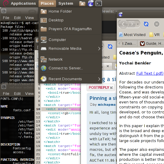
Second is unpatched with rgba set to none:
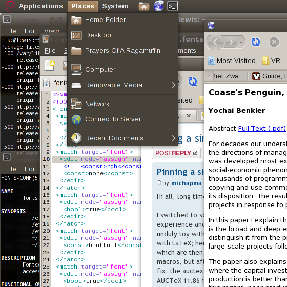
Third is patched with rgba set to rgb:
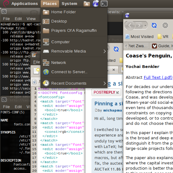
Fourth is patched with rgba set to none:
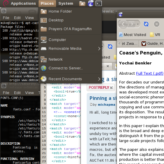
There are real differences to see here besides just the “fuzziness,” although I don't know that the screenshots display on your screen as they do on mine. A Treatise on Font Rasterisation With an Emphasis on Free Software provides a first-rate review of the concepts. I like the hinting provided by the patch, which indeed does seem less accurate but more consistent. It was possibly the lack of sub-pixel rendering without the patch that has bothered me so much. The filtering also plays a big role—compare the difference in color fringing between the first two and last two screens. The difference in color fringing is very obvious on the man page.
I like the rendering in gedit better in the unpatched version, but the rendering in Firefox is far better (not evident just from these screenies). Unfortunately, emacs appears to use a different engine for rendering as it is unaffected. The terminal looks gorgeous (white on black).
Cheers,
Mike
For the font-rendering settings in Gnome I used “Subpixel (LCDs)” under smoothing, “Full” under hinging, and “RGB” under subpixel order. The resolution is set to 94 dpi based on the value I calculated. Here is the .fonts.conf I used; the only line I edited for these screenshots is the value for rgba (see the comment here, which is cited in this Lenny review):
Code: Select all
<?xml version='1.0'?>
<!DOCTYPE fontconfig SYSTEM 'fonts.dtd'>
<fontconfig>
 <match target="font">
  <edit mode="assign" name="autohint">
   <bool>true</bool>
  </edit>
 </match>
 <match target="font">
  <edit mode="assign" name="rgba">
   <!-- <const>rgb</const> -->
   <const>none</const>
  </edit>
 </match>
 <match target="font">
  <edit mode="assign" name="hinting">
   <bool>true</bool>
  </edit>
 </match>
 <match target="font">
  <edit mode="assign" name="hintstyle">
   <const>hintfull</const>
  </edit>
 </match>
 <match target="font">
  <edit mode="assign" name="antialias">
   <bool>true</bool>
  </edit>
 </match>
</fontconfig>Second is unpatched with rgba set to none:
Third is patched with rgba set to rgb:
Fourth is patched with rgba set to none:
There are real differences to see here besides just the “fuzziness,” although I don't know that the screenshots display on your screen as they do on mine. A Treatise on Font Rasterisation With an Emphasis on Free Software provides a first-rate review of the concepts. I like the hinting provided by the patch, which indeed does seem less accurate but more consistent. It was possibly the lack of sub-pixel rendering without the patch that has bothered me so much. The filtering also plays a big role—compare the difference in color fringing between the first two and last two screens. The difference in color fringing is very obvious on the man page.
I like the rendering in gedit better in the unpatched version, but the rendering in Firefox is far better (not evident just from these screenies). Unfortunately, emacs appears to use a different engine for rendering as it is unaffected. The terminal looks gorgeous (white on black).
Cheers,
Mike

Re: About the LCD ClearType patch
That looks crisper than most scrots posted. Perhaps it is the vodka, but I think it looks really good.
I wish for a conjugal visit and world peace. (Don't want to seem selfish.)

Re: About the LCD ClearType patch
Yes, vodka is the best font smoother, and not only font!Perhaps it is the vodka
Re: About the LCD ClearType patch
There is no such thing as rape, only surprise sex. Yes, that's retarded. No Debian Women were harmed, though.vmamonov wrote:Yes, vodka is the best font smoother, and not only font!Perhaps it is the vodka"there are no ugly girls, there is very few of vodka"
My text looks pretty clean. I will look again tomorrow to make sure.
I wish for a conjugal visit and world peace. (Don't want to seem selfish.)
-
sconosciuto
- Posts: 5
- Joined: 2011-02-19 13:46
Re: About the LCD ClearType patch
Hi everyone.
I know that libcairo2 1.10 is already patched, however I see some differences from libcairo2 1.8 patched (I used the one patched by Hadret). With libcairo2 1.8 my fonts look more smooth, so I tried to install libcairo2 1.10 patched (the one from hadret repo). However I can't see any difference from the official one.
Here there are two screenshots:
libcairo2 1.8

libcairo2 1.10

How can I patch libcairo2 1.10 to make the fonts look like the fonts in the first picture?
Some of you maybe think that the fonts in the second picture are better (they are less faded), but with a bigger screen and libcairo2 1.10 the fonts look more aliased. (I didn't try with libcairo2 1.8 patched, but I would like to keep libcairo2 1.10).
Any suggestions?
Re: About the LCD ClearType patch
Where did you get libcairo2 version 1.8 from ? Is it from here : http://debian.hadret.com/libcairo2/
Libcairo2 version 1.10 looks the same as the default from Debian...
Libcairo2 version 1.10 looks the same as the default from Debian...
Debian Bits And Snips
Squeeze, Gnome, amd64, Intel Core i3-530, Geforce GT330
Squeeze, Gnome, amd64, Intel Core i3-530, Geforce GT330
-
sconosciuto
- Posts: 5
- Joined: 2011-02-19 13:46
Re: About the LCD ClearType patch
Yes, but libcairo2 1.10 from here. This is the changelog in the package:
So the patch is applied, but the result is what you see in the second screenshot.
Code: Select all
cairo (1.10.2-2.1) unstable; urgency=low

  * Non-maintainer upload.
  * Ported Ubuntu patches and settings.

 -- Filip Chabik <hadret@gmail.com>  Wed, 16 Feb 2011 18:46:20 +0100