Page 3 of 5
Re: Forum and server updates - Moving, fixes, and new admins.
Posted: 2021-07-17 10:00
by mm3100
Noticed that when I go over unread notification it shows button to set to read. But would still be nicer if it was visible which ones are unread.
Re: Forum and server updates - Moving, fixes, and new admins.
Posted: 2021-07-17 10:08
by oswaldkelso
First off thanks to trying to address the issues with the new themes. Hope you find my observations constructive as intended.
Carbon is unusable as the swirl icon takes up the whole screen (Seamonkey). Necessitating a large scroll to even know where you are. Which reminds me of Dillo with remote css enabled. The fix for Dillo. tools> uncheck remote css. Keep use embedded css checked. This takes it from outright sh*t to a bit weird in case anyone is interested.

Whilst I agree that the hamburg menu is extra actions and a bit inefficient. I suspect it's for mobiles? I just bookmark active topics and open threads I'm interested in in new tabs as I've always done. Works great.
The dead white space is an issue. Only 2 of the 18 styles offer full width. Red 2020 is to bright for my eyes and proDVGFX which is to Dark!
As wih a lot of Red themes it's a major issue for many. This is why all the slaveware PC manufacturers tend to default to Blue.
https://www.nhs.uk/conditions/colour-vision-deficiency.
I like the default theme along with prosilver both are easy for me and my failing eyes to read, but have no Idea how to apply the css fix for 100% width. Could I request both these be available as flatstyle-100 and prosilver-100 this would fix the dead space poor efficiency issue and the vision issue for those of us with poor eye sight.
Thank you
Re: Forum and server updates - Moving, fixes, and new admins.
Posted: 2021-07-17 10:33
by steve_v
oswaldkelso wrote: ↑2021-07-17 10:08Whilst I agree that the hamburg menu is extra actions and a bit inefficient. I suspect it's for mobiles?
Of course it is. Everything is "for mobiles" these days, even when A: a static website works just fine on mobile anyway, and B: the topic at hand has absolutely nothing to do with mobiles.

Why anyone would subject themselves to technical discussion on a phone, with the code snippets and such that inevitably entails, is rather beyond me. If we had a "random trivia in posts of 15 words or less" sub, I'd get it. We don't. That's what twitter is for.
oswaldkelso wrote: ↑2021-07-17 10:08I just bookmark active topics and open threads I'm interested in in new tabs as I've always done.
It's great that that works for you, but bookmark menus, like these new hamburgers, take me about 10 times as long to find, open and traverse than the old header links did. Space in my bookmark
toolbar is far too precious to spend fixing every bloody forum.
oswaldkelso wrote: ↑2021-07-17 10:08Only 2 of the 18 styles offer full width. Red 2020 is to bright for my eyes and proDVGFX which is to Dark!
Likewise. Red 2020 is the least awful full-width theme IMO, but it's far too bright, and far too red.
oswaldkelso wrote: ↑2021-07-17 10:08Could I request both these be available as flatstyle-100 and prosilver-100 this would fix the dead space poor efficiency issue and the vision issue for those of us with poor eye sight.
While my eyesight isn't
completely borked yet, I still wholeheartedly second that request.
Re: Forum and server updates - Moving, fixes, and new admins.
Posted: 2021-07-17 15:12
by golinux
oswaldkelso wrote: ↑2021-07-17 10:08
I like the default theme along with prosilver both are easy for me and my failing eyes to read, but have no Idea how to apply the css fix for 100% width. Could I request both these be available as flatstyle-100 and prosilver-100 this would fix the dead space poor efficiency issue and the vision issue for those of us with poor eye sight.
I have been playing with fixing this. Found the wrap element(s) that "should" have allowed a % to work but no joy yet. I have tweaked phpBB before and it is a rat's nest so resisting that deep dive. Will post if I manage to crack it. And yes, it is a pita to have to rewrite the web from mobile madness back to sanity. But then mobile phones themselves are insanity. No way I'm going down that road. RESIST!
[edit] Change of plans . . . It's unlikely I will be putting any effort into debugging the width limitation.
Re: Forum and server updates - Moving, fixes, and new admins.
Posted: 2021-07-17 22:56
by donald
steve_v wrote: ↑2021-07-16 11:54
I see FDN has had a hamburger attack. And apparently it's into that slimming shapewear fad now as well. Sigh.
Could we not, you know, use
all that empty space to put the "quick links" in? Like a proper website, with links 'n stuff on it instead of silly dropdown click-wasters?
Maybe even use the other third of my screen-width for something other than whiteness perhaps? That'd be swell too...
I think and from what I am seeing from the available styles that the focus with css has moved to mobile devices. Not many of the themes are full screen.
steve_v wrote: ↑2021-07-16 14:19
Ganneff wrote: ↑2021-07-16 12:53
Switch your theme, some of them do go full width.
Well that fixes one problem. Thanks, much better. Still far too much fast-food for my taste though, I'm really not sure what was wrong with the old navigation links.
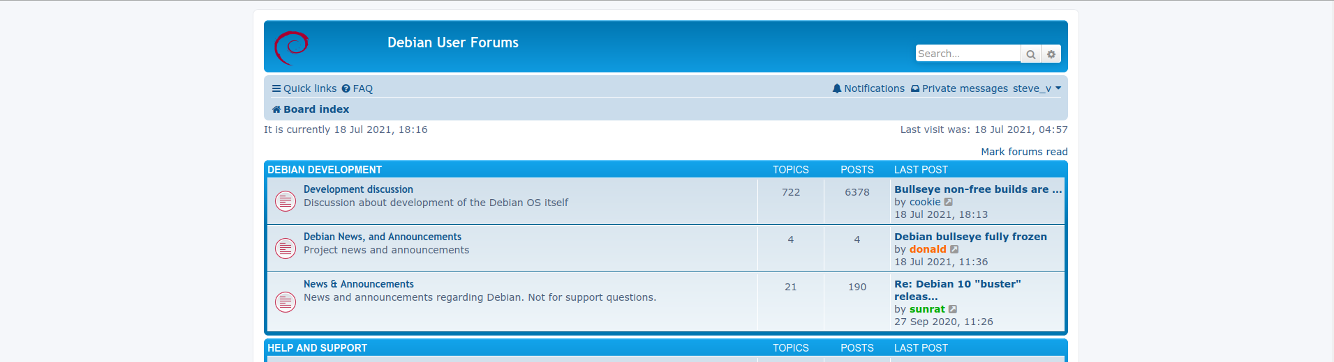
Aside, some of those themes seem a bit... broken. Carbon renders the debian banner logo blown up to nearly a whole page for example, and Quantum doesn't show one at all, just the placeholder. Proflat shows self-advertisement in that spot, and it has a bunch of irrelevant social media buttons, one of which is a link to French facebook.
The index page also looks kinda odd in any theme, post previews being squashed up against the right hand side like that pushes sub-board listings where the last post preview has more than three words in the title out to four lines.
Stuff like this:
Re: Debian 10 "buster"
releas…
by sunrat View the latest post
2020-09-27 10:26
seems pretty silly when there's a bunch of empty in the middle of the page. That one is extra silly even, as the topic title would probably fit... if it wasn't for the ellipsis itself. And don't get me started on cutting off "released" for no reason at all, not only does it get it's own whole line, the ellipsis is
more characters than it replaces.
It's almost as if this thing was *cough* designed for mobile first. Last I checked not many people run Debian on their mobile.
I disabled Carbon, it for the most part was unusable and requires too much tinkering which will probably break at the next update. I'm trying for little maintenance.
cookie wrote: ↑2021-07-17 02:44
Minor thing, but perhaps allow users to switch avatars/author's information to the left side of the screen?
Also, accepting Markdown in addition to BBCode would be handy.
It goes according to the theme you select, some have the user information on the right and others on the left.
I love the markdown idea and there is a mod available for it. I'm going to look for any vulnerabilities with it before committing it. Ping me in a few to see if we can add it. I'd like to concentrate on the overall theme and other minor stuff first.
oswaldkelso wrote: ↑2021-07-17 10:08
First off thanks to trying to address the issues with the new themes. Hope you find my observations constructive as intended.
Carbon is unusable as the swirl icon takes up the whole screen (Seamonkey). Necessitating a large scroll to even know where you are. Which reminds me of Dillo with remote css enabled. The fix for Dillo. tools> uncheck remote css. Keep use embedded css checked. This takes it from outright sh*t to a bit weird in case anyone is interested.
Whilst I agree that the hamburg menu is extra actions and a bit inefficient. I suspect it's for mobiles? I just bookmark active topics and open threads I'm interested in in new tabs as I've always done. Works great.
The dead white space is an issue. Only 2 of the 18 styles offer full width. Red 2020 is to bright for my eyes and proDVGFX which is to Dark!
As wih a lot of Red themes it's a major issue for many. This is why all the slaveware PC manufacturers tend to default to Blue.
https://www.nhs.uk/conditions/colour-vision-deficiency.
I like the default theme along with prosilver both are easy for me and my failing eyes to read, but have no Idea how to apply the css fix for 100% width. Could I request both these be available as flatstyle-100 and prosilver-100 this would fix the dead space poor efficiency issue and the vision issue for those of us with poor eye sight.
Thank you
I deleted Carbon and Quantum. I agree on the blue.
Re: Forum and server updates - Moving, fixes, and new admins.
Posted: 2021-07-17 22:58
by donald
Ok, new themes!
Revolution: Grey and blue, column style, info on the right.
AcidTech: Full screen, grey and blue, info on the left.
Simplicity: Full screen, green, info on the left.
Rock and Roll: Wider, greyish.
SE Square Left: Column, bluish, info on the right.
AllanStyle Subsliver: Full screen, blue and grey. This one will likely be the new default.
Lets give this *just a bit* more discussion. As I mentioned I think the last one will become the new default and we can remove the other installed themes to get down to 1 default and 3 or 4 selections. Each of the themes does require a small amount of labor for the logos, etc....it's pretty but a waste of admin time.
Re: Forum and server updates - Moving, fixes, and new admins.
Posted: 2021-07-17 23:22
by 4D696B65
donald wrote: ↑2021-07-17 22:58
AllanStyle Subsliver: Full screen, blue and grey. This one will likely be the new default.
Nice, all it needs is the debian logo in place of the phpbb in the top left
edit. Looks fine on a phone too
Re: Forum and server updates - Moving, fixes, and new admins.
Posted: 2021-07-18 00:14
by steve_v
donald wrote: ↑2021-07-17 22:58AllanStyle Subsliver: Full screen, blue and grey. This one will likely be the new default.
Yeah, that one's not bad. Probably about as close as it's going to get to the old look, and yay, there's some non-hamburger links up there too. Win.
Re: Forum and server updates - Moving, fixes, and new admins.
Posted: 2021-07-18 00:41
by oswaldkelso
steve_v wrote: ↑2021-07-18 00:14
donald wrote: ↑2021-07-17 22:58AllanStyle Subsliver: Full screen, blue and grey. This one will likely be the new default.
Yeah, that one's not bad. Probably about as close as it's going to get to the old look, and yay, there's some non-hamburger links up there too. Win.
A thumbs up from me...... I must admit I usually use "Desktop view" if I have to use a mobile.

My Degree is in interactive graphic design . By my own admission I am pretty crap at it but one thing I became nutty about was user interfaces. I was biting my tongue about some of the very obvious flaws like search in he quick links and the main interface. yada yadda yada.... All History

My sincere thanks for not just listening but taking on and acting on the feed back. Dillo works, Seamonkey, works, full width (so tiling window managers are as efficient as their meant to be) works. Colors (colours) works for most colour blind.. unanswered and active topics are now logically shown. What is not to like?
Re: Forum and server updates - Moving, fixes, and new admins.
Posted: 2021-07-18 02:37
by donald
The favicon is back.
2 new features:
Thank users for their posts, you should see the icon with a thumbs up.
Thread information hover, if you hover over a thread the first few words of the post will show up in a preview window.
Just trying these out, lets see if they affect server load.
Re: Forum and server updates - Moving, fixes, and new admins.
Posted: 2021-07-18 04:13
by cookie
donald wrote: ↑2021-07-17 22:56
It goes according to the theme you select, some have the user information on the right and others on the left.
I love the markdown idea and there is a mod available for it. I'm going to look for any vulnerabilities with it before committing it. Ping me in a few to see if we can add it. I'd like to concentrate on the overall theme and other minor stuff first.
I have changed to the phpBB default theme and seemingly unable to find the switch. Any clues?
"+1" on the markdown, GFM flavour seems to be a standard these days, but any will be more user-friendly than bbCode.
Another idea - allow users to reply using selected text as the quote source. There is at least one extension that does this:
https://www.phpbb.com/customise/db/exte ... ern_quote/
Lastly, wouldn't it be best to stick with the default "prosilver" theme as the least likely to break with the phpBB upgrades?
Re: Forum and server updates - Moving, fixes, and new admins.
Posted: 2021-07-18 04:38
by steve_v
cookie wrote: ↑2021-07-18 04:13Any clues?
I've been through every theme provided several times, and as far as I can see the theme selection dropdown is always in the same place, in the same preferences page.
cookie wrote: ↑2021-07-18 04:13any will be more user-friendly than bbCode.
So long as it doesn't
replace BBCode support or force the use of use some horrible javascript-infested wysi(n)wyg editor, whatever. BBCode has been a standard for over 20 years, and with good reason.
cookie wrote: ↑2021-07-18 04:13Another idea - allow users to reply using selected text as the quote source.
That'd be handy, and the javascript component of the plugin looks to be minimal.
So long as it doesn't break established standards, and fails gracefully with javascript disabled, yeah, why not.
Then again, it's not exactly a big deal to trim your quotes properly, so I'd call such a feature "nice to have, but only if it's falling-off-a-log easy to maintain".
cookie wrote: ↑2021-07-18 04:13wouldn't it be best to stick with the default "prosilver" theme as the least likely to break with the phpBB upgrades?
Sure, if it was a sane default on a proper screen... Which it clearly isn't. Going from the old board to that ridiculous mobile layout isn't an upgrade.
Re: Forum and server updates - Moving, fixes, and new admins.
Posted: 2021-07-18 05:55
by sunrat
steve_v wrote: ↑2021-07-18 04:38
cookie wrote: ↑2021-07-18 04:13wouldn't it be best to stick with the default "prosilver" theme as the least likely to break with the phpBB upgrades?
Sure, if it was a sane default on a proper screen... Which it clearly isn't. Going from the old board to that ridiculous mobile layout isn't an upgrade.
"prosilver" is my preferred theme and closest to the old layout. On my screen the browser is set to 2,456px and this theme fills that width. I tried several of the themes you said you prefer and rather dislike them. Why doesn't everybody like the same things?

No issue with the hamburger menu, in fact I like being able to refresh "Unread Posts" using it rather than having to go back to index page to do it.
Re: Forum and server updates - Moving, fixes, and new admins.
Posted: 2021-07-18 06:03
by golinux
sunrat wrote: ↑2021-07-18 05:55
No issue with the hamburger menu, in fact I like being able to refresh "Unread Posts" using it rather than having to go back to index page to do it.
A link in my Bookmarks bar is always right in front of me and just one click away . . .

Re: Forum and server updates - Moving, fixes, and new admins.
Posted: 2021-07-18 06:05
by sunrat
golinux wrote: ↑2021-07-18 06:03
sunrat wrote: ↑2021-07-18 05:55
No issue with the hamburger menu, in fact I like being able to refresh "Unread Posts" using it rather than having to go back to index page to do it.
A link in my Bookmarks bar is always right in front of me and just one click away . . .
Haha, Bookmarks bar is something I really don't care for.
Why doesn't everybody like the same things?
Re: Forum and server updates - Moving, fixes, and new admins.
Posted: 2021-07-18 06:10
by steve_v
sunrat wrote: ↑2021-07-18 05:55"prosilver" is my preferred theme and closest to the old layout. On my screen the browser is set to 2,456px and this theme fills that width
Well sure. If you've got some magic sauce to make prosilver full-width in a maximized browser window on a standard 16:9 monitor, without a bunch of client-side CSS overrides, that'd work for me too.
Do I really need to post screenies to show all the wasted whitespace I'm talking about? Surely not.
sunrat wrote: ↑2021-07-18 05:55I like being able to refresh "Unread Posts" using it rather than having to go back to index page to do it.
You don't have to go back to the index page
or open a silly hamburger menu if those navigation links are in the header... as they are using the new subsilver theme. It's literally a single click away no matter where you are on the boards, as it should be.
Of course I guess you might be talking about some newfangled javascript "refresh" thing... but as this site still works fine without all that crap, I see no reason to turn it on. The non-reliance on JS makes it quite nice to use in lynx too.
Re: Forum and server updates - Moving, fixes, and new admins.
Posted: 2021-07-18 06:12
by cookie
steve_v wrote: ↑2021-07-18 04:38
I've been through every theme provided several times, and as far as I can see the theme selection dropdown is always in the same place, in the same preferences page.
I am after the "which side to use for the user info", not the theme switch. Like this:

steve_v wrote: ↑2021-07-18 04:38
So long as it doesn't
replace BBCode support or force the use of use some horrible javascript-infested wysi(n)wyg editor, whatever. BBCode has been a standard for over 20 years, and with good reason.
Sure!
steve_v wrote: ↑2021-07-18 04:38
Sure, if it was a sane default on a proper screen... Which it clearly isn't. Going from the old board to that ridiculous mobile layout isn't an upgrade.
Are we talking about the same theme? I am referring to the default, blueish phpBB one that is called "prosilver" here.
Re: Forum and server updates - Moving, fixes, and new admins.
Posted: 2021-07-18 06:17
by cookie
While replying to
viewtopic.php?f=19&t=149721, two more things came to my mind:
- Ability to mark threads as "solved" and showing them as such in the threads list
- Allow users to "close" threads.
Also, "ordered list" button in the editor creates unordered one:
Code: Select all
[list=1] # The "1" is missing by default
Re: Forum and server updates - Moving, fixes, and new admins.
Posted: 2021-07-18 06:20
by cookie
steve_v wrote: ↑2021-07-18 06:10
Well sure. If you've got some magic sauce to make prosilver full-width in a maximized browser window on a standard 16:9 monitor, without a bunch of client-side CSS overrides, that'd work for me too.
Do I really need to post screenies to show all the wasted whitespace I'm talking about? Surely not.
You just need to change a single "max-width":

Re: Forum and server updates - Moving, fixes, and new admins.
Posted: 2021-07-18 06:31
by steve_v
cookie wrote: ↑2021-07-18 06:12Are we talking about the same theme? I am referring to the default, blueish phpBB one that is called "prosilver" here.
Pretty sure we are.
prosilver:
subsilver:
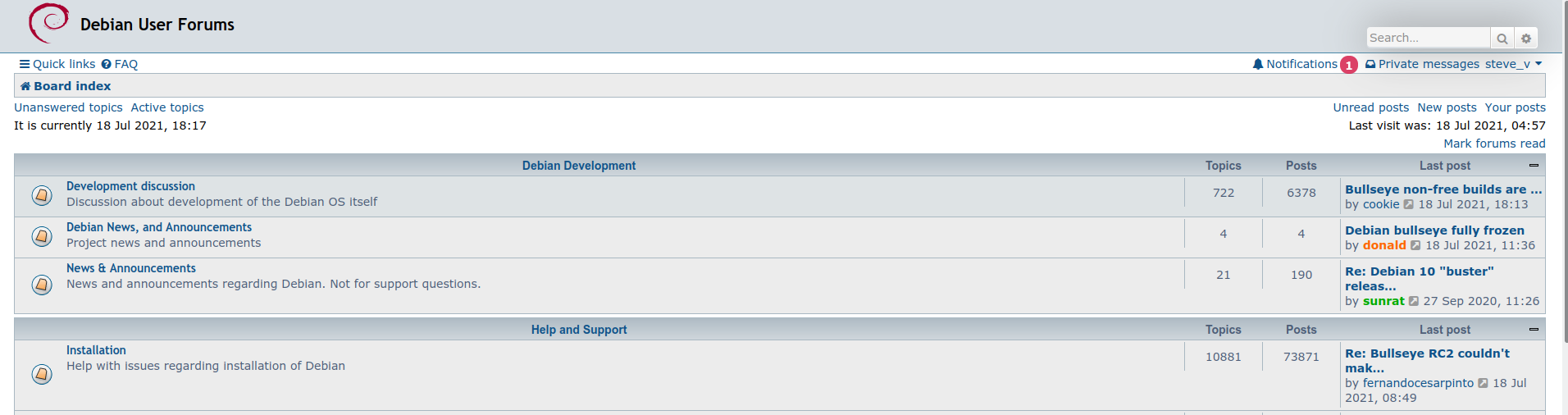
Other differences aside, one is clearly full-width, the other has a bunch of blindingly-empty whiteness on either side. Notice how
more content is available with
less scrolling when the view isn't jammed in a 2/3 wide strip down the middle.
cookie wrote: ↑2021-07-18 06:12You just need to change a single "max-width"
Yes. I know. My point is that I shouldn't have to, and that wasting so much screen space is a stupid default. I would rather like this usually-not-stupid board to have an equally not-stupid default theme.
If one wants a narrower view, one can just resize the
browser window, same as it's been done for decades. If I then maximise said window I expect the content to respect it, not be limited to some arbitrary "max width".
The latter, again, smacks of a theme designed for
mobile first.
The pre-"upgrade" default theme was full-width, why should I have to jump through hoops to get back to that?
cookie wrote: ↑2021-07-18 06:17
[*] Ability to mark threads as "solved" and showing them as such in the threads list
[*] Allow users to "close" threads.
What's wrong with prepending [SOLVED] or [CLOSED] to the thread title, same as we've been doing forever?